Case Study
Thepowerusernobodywasbuildingfor.
Lune · AI-First Wedding Planning Workspace
Professional wedding planners run ten weddings at once. Every tool was built for the couple. I took Lune from brand to deployed prototype in two weeks.
Role
Designer & PM
Timeline
2 weeks · 0→1
Stack
Claude · Cursor · Figma
Impact at a glance
Brand to code in 14 days.
40×
Planners use wedding tools 40 times a year. A couple uses them once.
2 weeks
Brand, a design system built for AI, Figma prototypes and a vibe-coded MVP, deployed and user-tested.
1 color
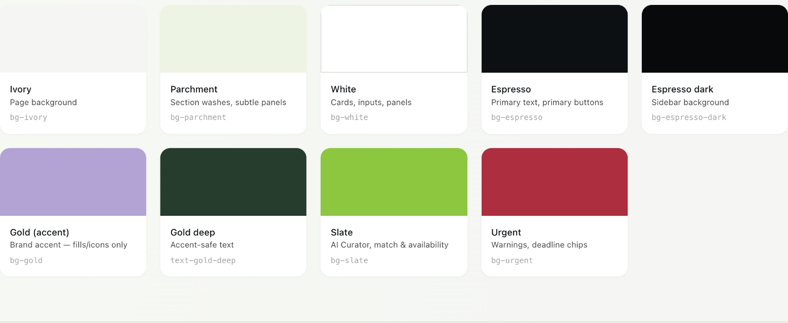
Slate green is reserved for AI-generated content, so users can always tell what Lune wrote.
The Problem
A planner managing 10 weddings is running 10 businesses at once.
A planner's real asset is the vendor network they've built over years: who is reliable, who fits which couple, who they'd put their name behind. That judgment lives in their head. No tool captures any of it.
They get by with spreadsheets, email threads and consumer apps made for a couple planning one wedding.
The network a planner runs on. No existing tool sees it.
The Pivot
I killed the original concept on day two.
The first concept was a shared workspace for couples. A competitive analysis showed it already existed at scale, so on day two we switched to planners.
Day 1 concept
Couples-first workspace
Already built, at scale:
- The Knot
- Zola
- WeddingWire
- Joy
Same features, near-identical design.
What we built
Planner-first workspace
- 40× yearly usage
- Deepest complexity needs
- Strongest word-of-mouth
Couples get a lightweight portal.
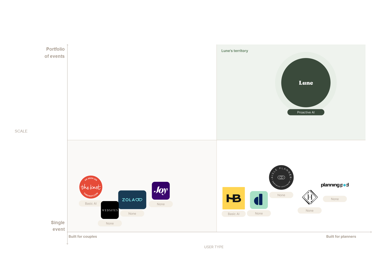
Planner-first on one axis, portfolio scale on the other. The top-right was empty.
The Product
One workspace, built around how planners actually work.
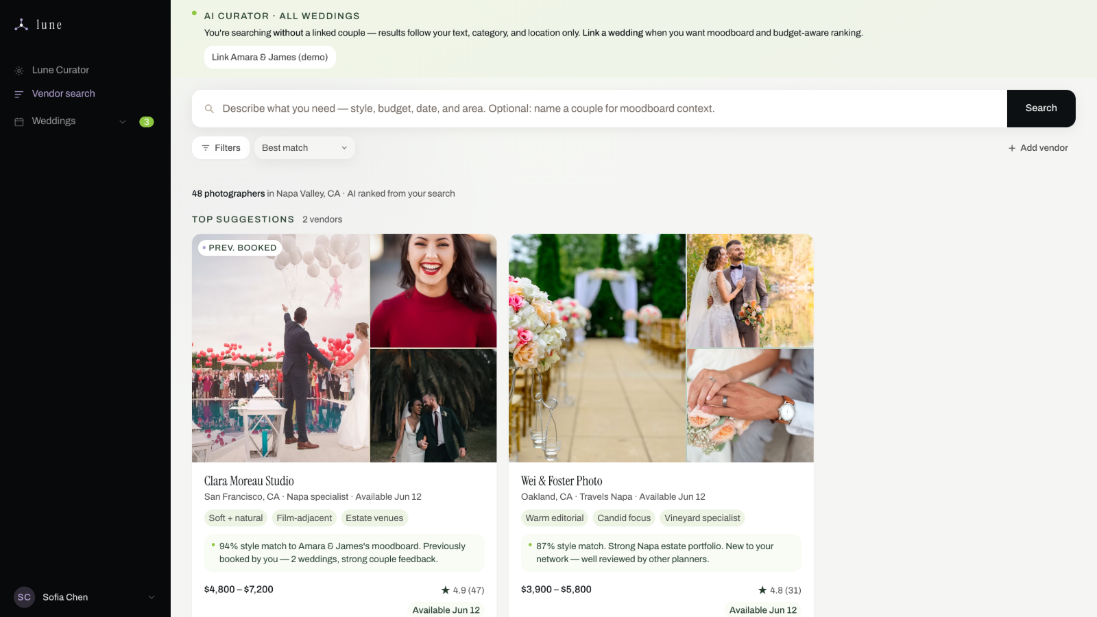
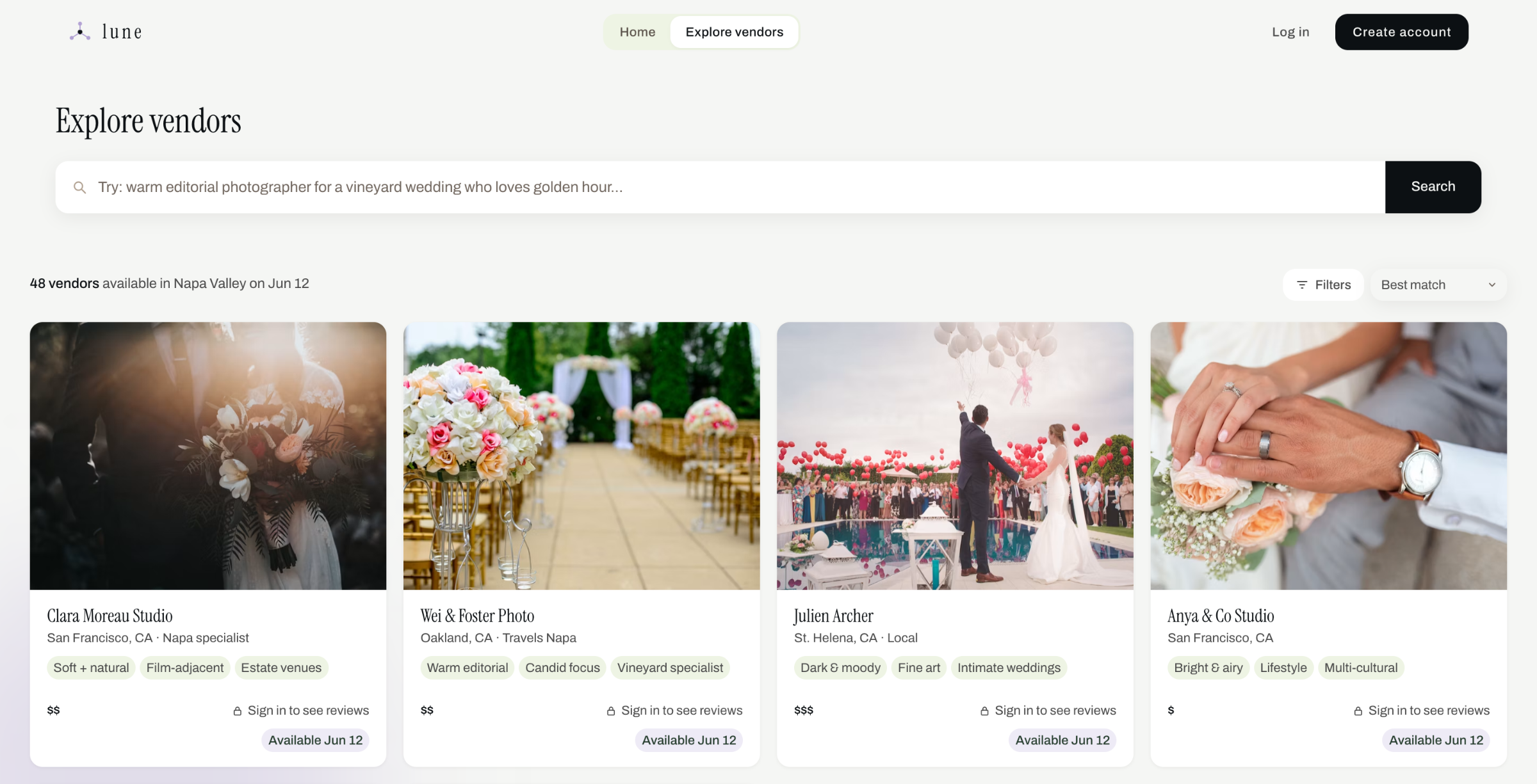
The dashboard shows the most urgent action for each wedding. Inside a wedding there are two tools. Lune Curator watches every active wedding and flags what needs attention. Vendor Search matches on moodboard, budget, history and availability.
The AI drafts the outreach. The planner reviews it and sends it.
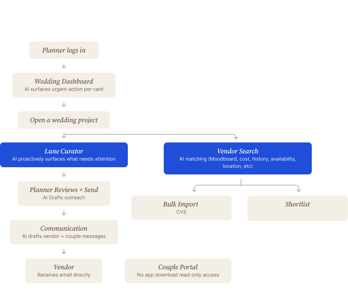
The core flow, from login to vendor outreach and the couple portal.
Brand Foundation
Brand in one day, before Figma.
I worked the positioning through with Claude first: archetype, voice against competitors, a five-year vision. Lune became the orchestrator of the wedding, with The Sage as its archetype. Each brand word came with the line it shouldn't cross.
- ComposednotFrantic
- IntelligentnotRobotic
- RefinednotLuxurious
- IntentionalnotPrecious
- WarmnotSentimental
Then tokens, then components, in that order.
Design System
My build partner was an LLM, so the design system had to be readable by one.
LLMs drift, make up token values and forget everything between sessions. Storybook doesn't help, because an AI can't read it. So I wrote DSYS: 15 markdown spec files, one concern per file, on a three-layer token architecture. Each file is a briefing for the AI.
The result was zero drift between sessions. Claude picked up where we left off with the right tokens and voice.
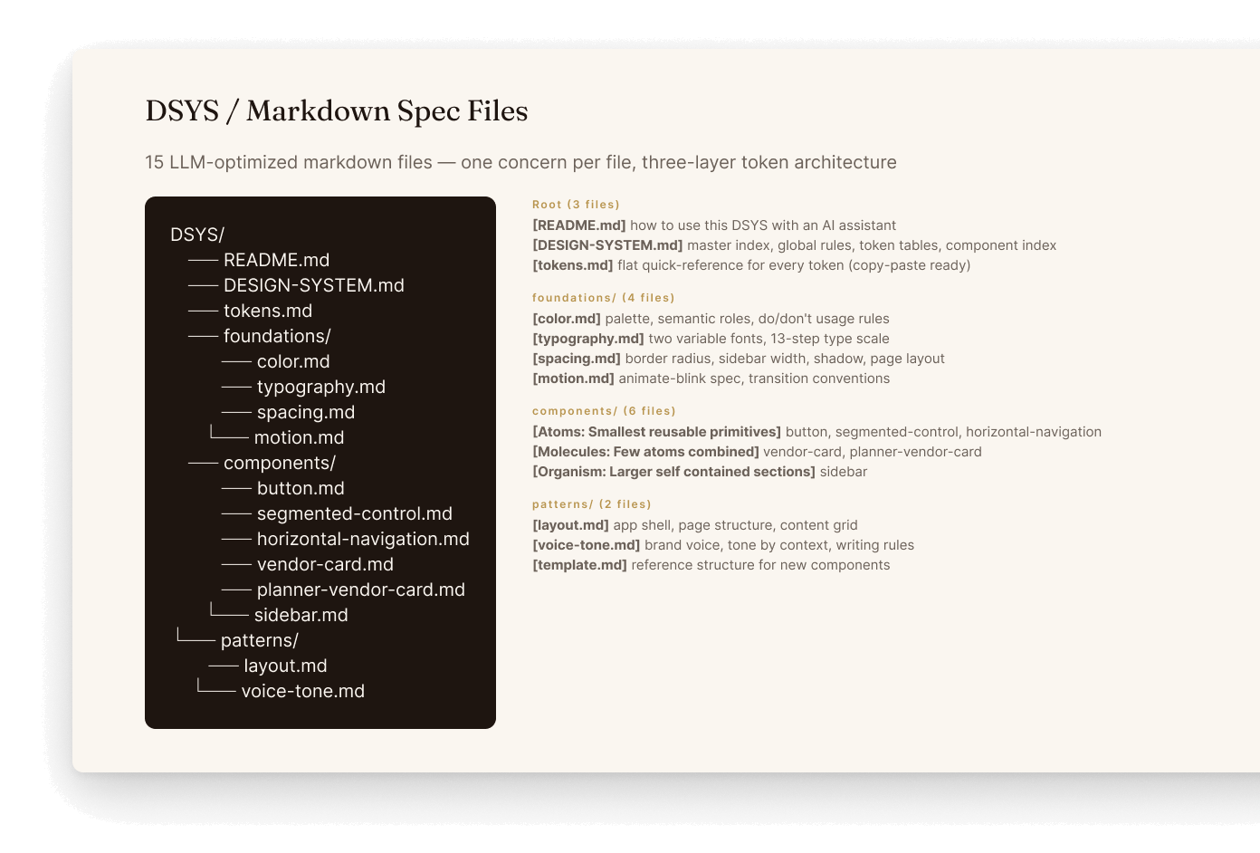
DSYS spec files: foundations, components and patterns, each written as a briefing for the AI.
Research
Testing proved both halves of my plan wrong.
I ran three sessions with professional planners: one warm contact, two from cold outreach. That's a small sample, so I used it for build decisions only.
What I assumed
What testing showed
02 Email runs underneath all of it. Lune sends from the planner's own mailbox. Couples get email and text, no app.
Planners won't onboard upfront.
Every tester skipped the setup form. Nobody will type in years of vendor history for a tool that hasn't proven itself. So onboarding became light and skippable, and the AI learns from the first real session.
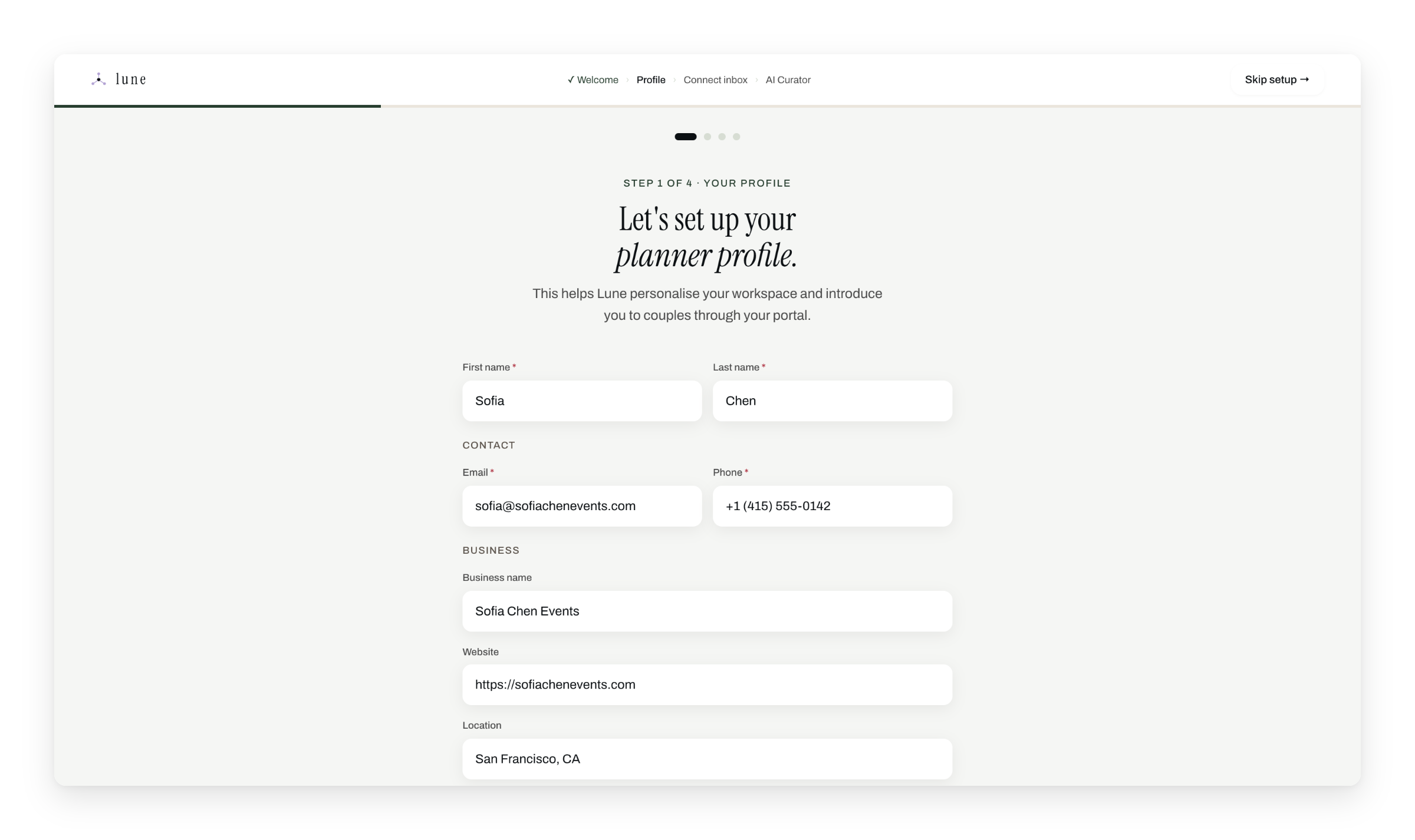
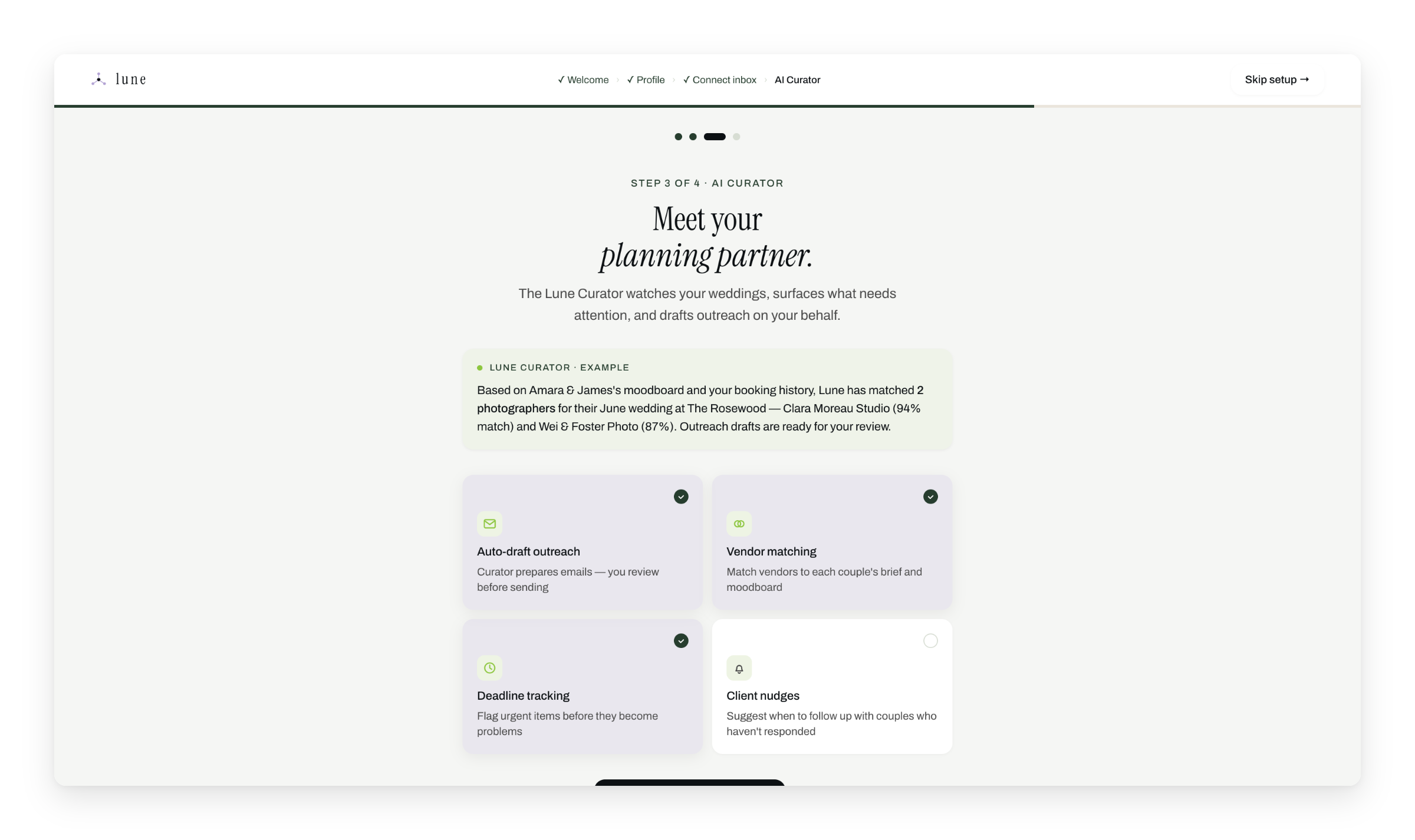
A profile and an inbox connection, skippable at every step. Curator shows a real match before setup ends.
Email integration is Phase 1, not Phase 2.
Planners will adopt a new tool. They won't make their couples download an app. So email moved into the core: Lune drafts outreach in the planner's voice and sends it from their own mailbox.
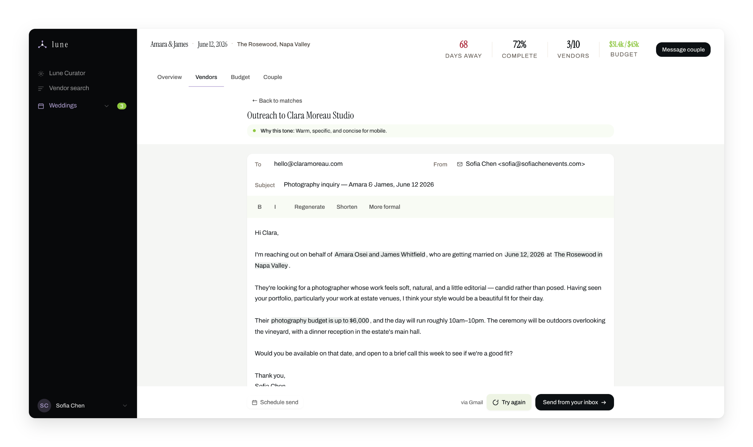
AI-drafted
Written in the planner's voice, with a note on why it chose that tone.
Human in control
The planner edits and sends. Details pulled from the brief show in green.
AI-drafted
Written in the planner's voice, with a note on why it chose that tone.
Human in control
The planner edits and sends. Details pulled from the brief show in green.
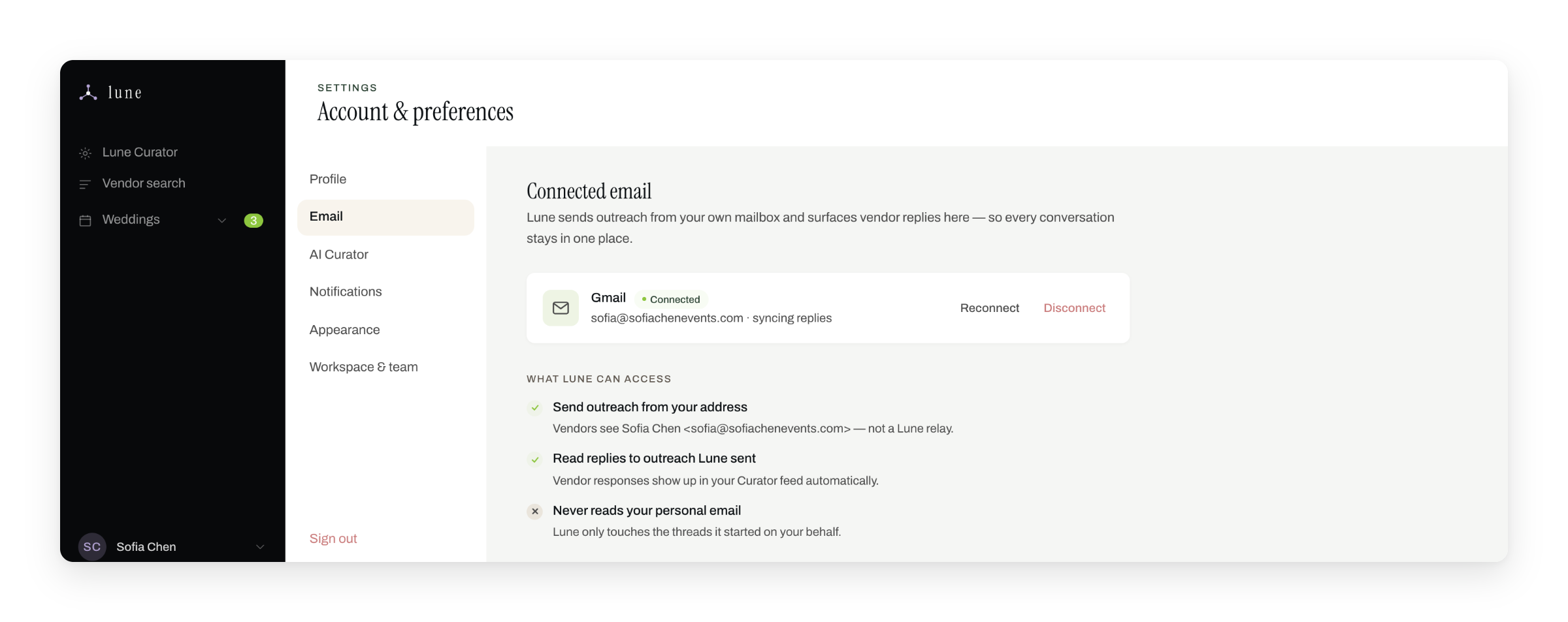
Scoped permissions
Sends from the planner's mailbox and only touches threads it started.
It never reads personal email.
Scoped permissions
Sends from the planner's mailbox and only touches threads it started.
It never reads personal email.
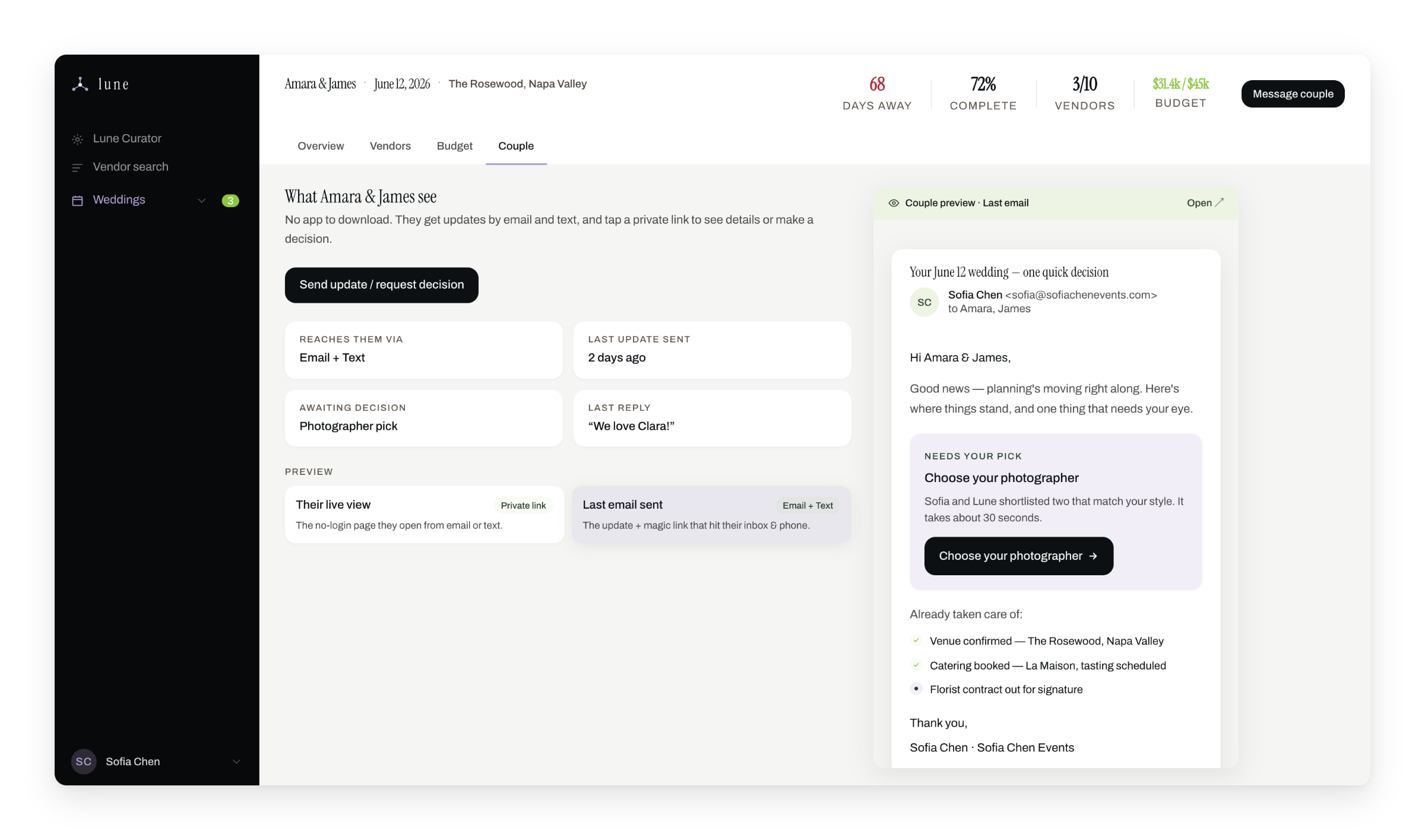
No app for couples
Updates and decisions go out by email and text.
One clear ask
Each request is a single action, like choosing a photographer.
No app for couples
Updates and decisions go out by email and text.
One clear ask
Each request is a single action, like choosing a photographer.
Import before search.
Planners arrive with a network already built and want it in the tool on day one. So import comes first, from CSV, Google Sheets or PDF. Moodboard-aware ranking sits on top.
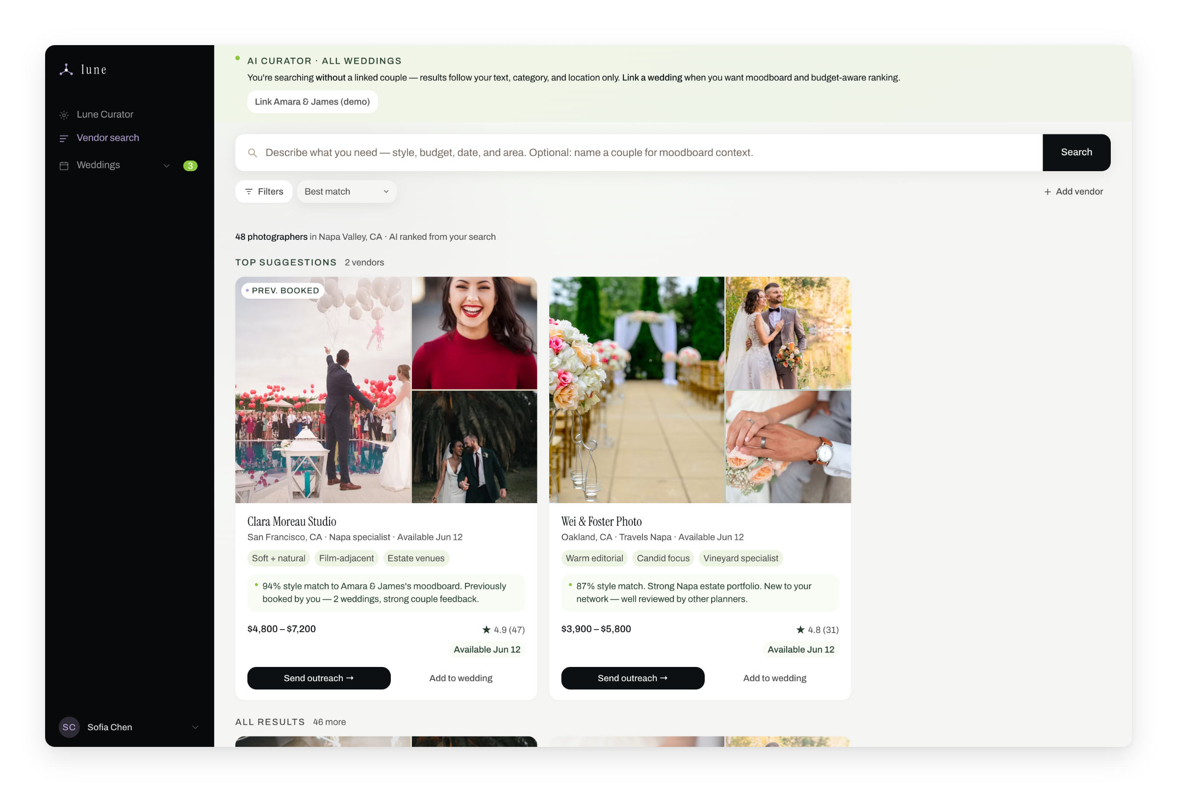
Moodboard-aware ranking
With a couple linked, vendors rank by fit with their moodboard.
Outreach in place
Send outreach straight from a result.
Moodboard-aware ranking
With a couple linked, vendors rank by fit with their moodboard.
Outreach in place
Send outreach straight from a result.
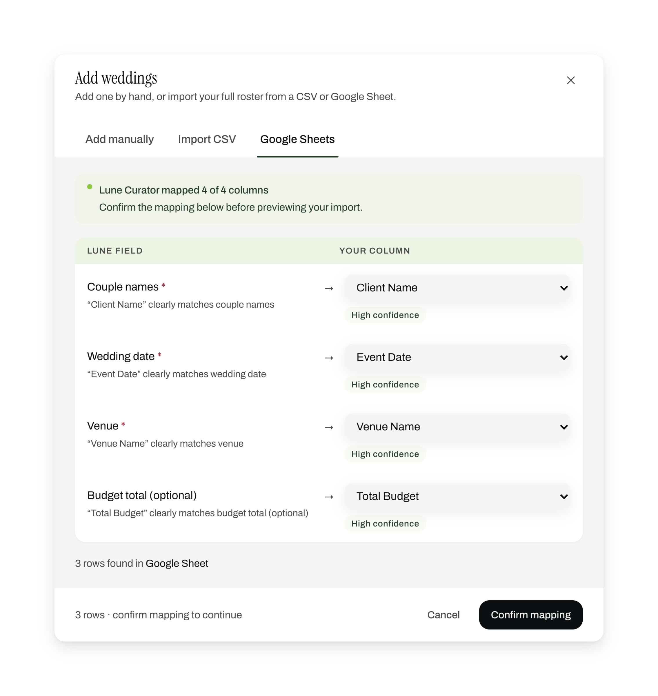
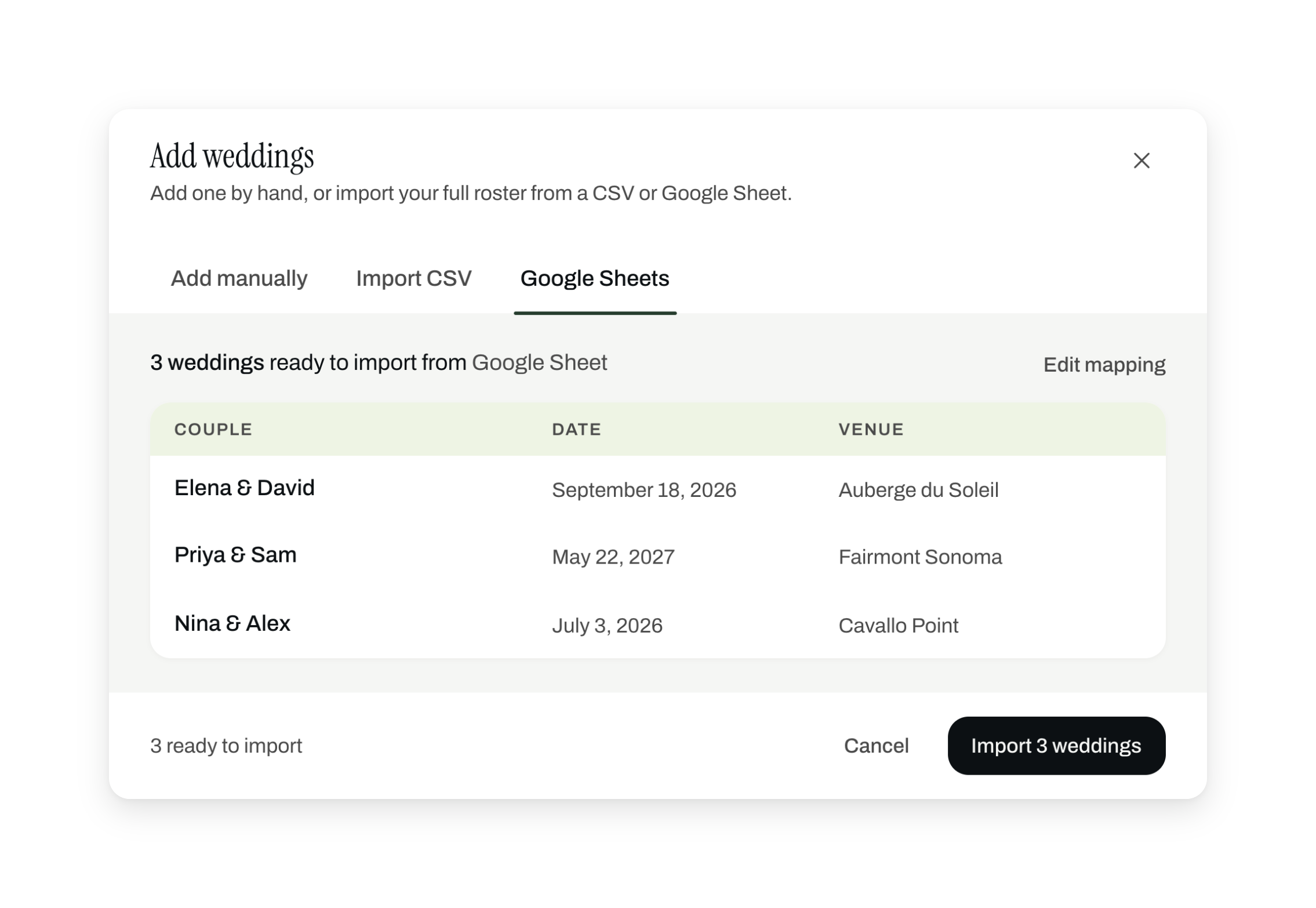
The existing network comes in before anyone is asked to search.
After the Sprint
Import had to be smarter than a button.
“Lune maps your columns automatically” is easy to design and hard to make true. No two spreadsheets name their columns the same way. So Curator learned to read the header row, match each column to a Lune field, and show its confidence before importing. A wrong guess takes one dropdown to fix.
Two more screens changed before the project ended. Vendor profiles used to open on a new page, which pulled planners out of the wedding. Now they open inside the wedding's tabs. The filter sidebar took a third of the screen, so it became a dropdown.
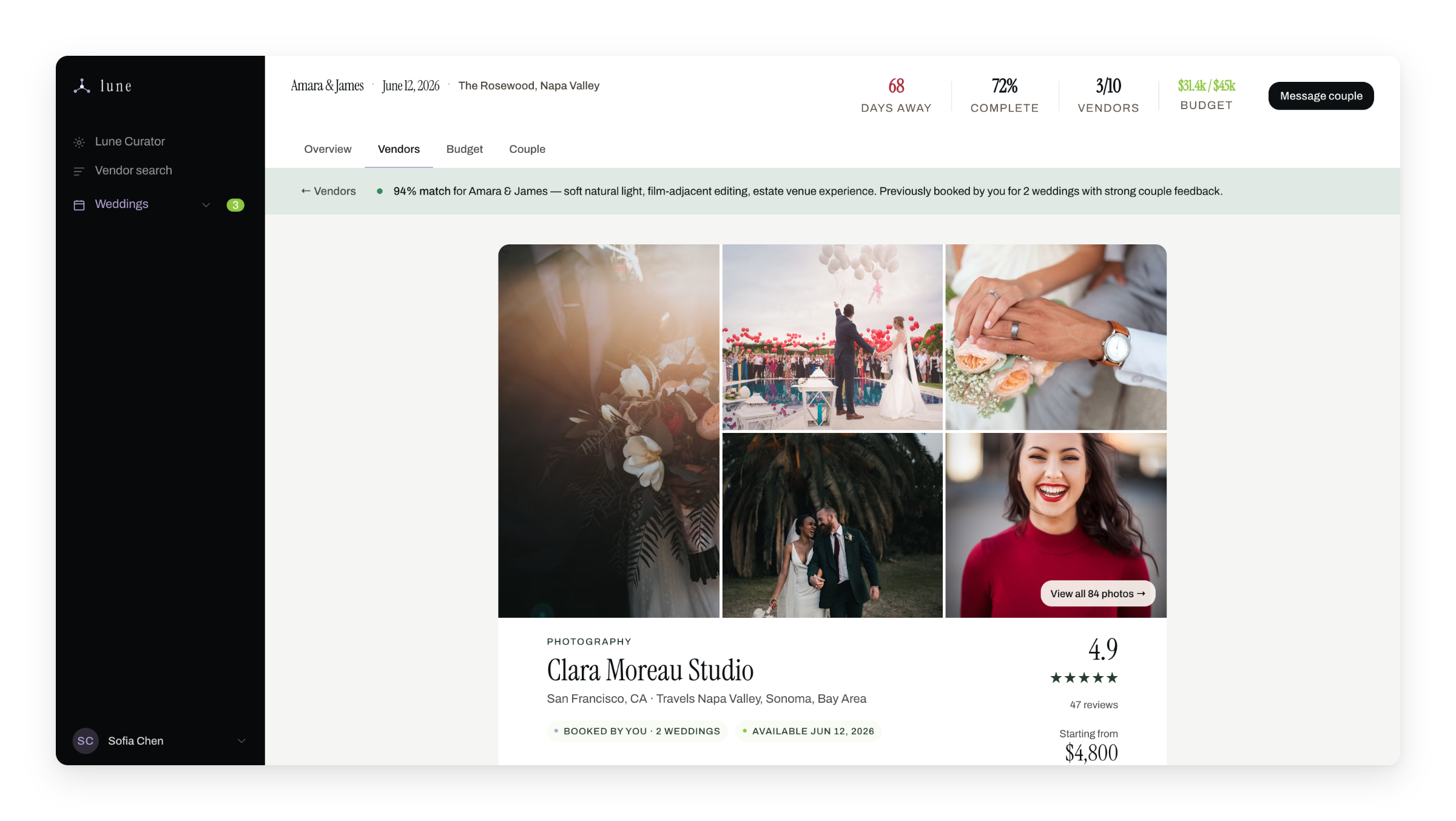
Stays in the workspace
Overview, Vendors, Budget and Couple stay one tab away.
Same match, now inline
Match and booking status carry over from search.
Stays in the workspace
Overview, Vendors, Budget and Couple stay one tab away.
Same match, now inline
Match and booking status carry over from search.
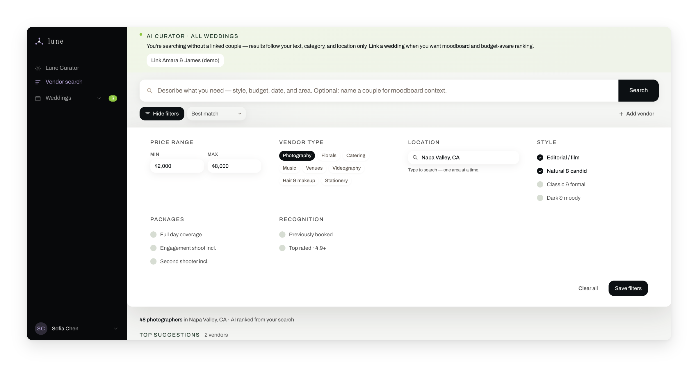
Filters open on demand, so results get the full width.
How it was built
How the two weeks went.
There was no PM, just a full-stack engineer and me, so the product calls were mine. I scoped the MVP to prove one thing: that the core planner workflow worked.
Week 1
Foundation
- Competitive analysis kills the couples-first concept
- Day 2: pivot to planners
- Brand foundation, built with Claude in one day
- DSYS tokens set up
- Core flows mapped
Claude: positioning, brand stress-testing, copy, design rationale
Week 2
Product
- MVP scoped: Curator, couple portal, dashboard, vendor search
- Designed and prototyped in Figma
- Vibe-coded in Cursor on top of DSYS
- Deployed to Vercel
- First user test
Cursor: components and the live prototype. Figma: visual design and specs.
The first session backed the dashboard and sharpened the problem. Managing projects wasn't the hard part. Managing people was, so communication is the core workflow.
Reflection
What I'd do differently.
Recruit while designing. Finding planners who would give us real time was the bottleneck of the sprint. Starting on day one would have bought a larger sample.
Write the MVP definition down first. One page on what we were building and what we weren't would have kept scope tighter.
What I'd keep is the color system. Slate green only ever meant AI, so nobody had to read a label to know what Lune generated. I first worked on AI trust at Komodo Health, with data scientists validating medical cohorts. It held up for wedding planners reviewing vendor outreach: when people can tell AI output from human output at a glance, they act on it.