Case Study
TheCoverStory
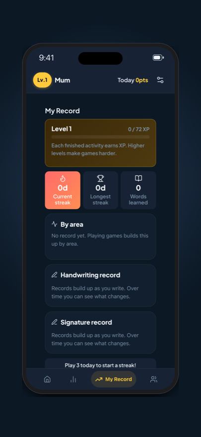
Brain Time: a daily brain workout that plays like a family English game, built for a dad who would never open an app that looked like a medical test.
Listed in Korea as Daily Brain Challenge and in the US as Brain Time: Family, since both preferred names were taken there. The web build is at dailybrainchallenge.app.
App
Brain Time · 두뇌 시간
Role
Solo Designer & Developer
Platform
iOS · iPadOS · Web
Status
1.2 live · 1.2.1 in review
Impact at a glance
I believed Dad played every day. The database said 2 days out of 14, so I rebuilt the app around that.
2 of 14 days
Days my dad completed an activity in the first two weeks on the App Store. In April, on the pre-account version, it was 3 of 23.
0 usable trends
A trend needs 6 play days a month. The most anyone logged in the 30 days to 25 September was 4, and that was me.
5 days straight
A stranger who joined on 26 September has played every day since, about ten activities a day.
In short
A disguised brain workout, and what the data made me change
Brain-training apps in Korea look like a diagnosis, and my dad avoids anything that suggests he is struggling. So I designed and built, alone, an app that trains the domains of the K-MMSE, the standard Korean dementia screen, dressed as a family English game.
I had two things wrong. The ability score was capped and could not see a fall from 95% to 75% accuracy. And my dad played 2 days out of 14, too few for any trend. The most regular player was a stranger.
So I split the app into a short, scored Brain Check and unscored Language Practice, and stopped hiding what the check is.
The Challenge
The apps that could help him are the ones he'd never open
Korean brain-training apps are clinical and aimed at older adults who already suspect something is wrong. My dad won't open anything that implies he's struggling. So the design problem was framing: train the right things without the app ever looking medical, and make him want to open it because it's fun.
The K-MMSE is the standard tool Korean physicians use to screen for early cognitive decline (Kang et al., 1997, adapting Folstein et al., 1975). Two of its domains matter most here: delayed recall, usually the earliest to weaken in Alzheimer's disease, and orientation to time, which tends to follow. Every game maps to a domain it measures.
I did all of it: concept, design, full-stack code and the clinical mapping. My parents had to be able to use it with no onboarding, tutorial or support.
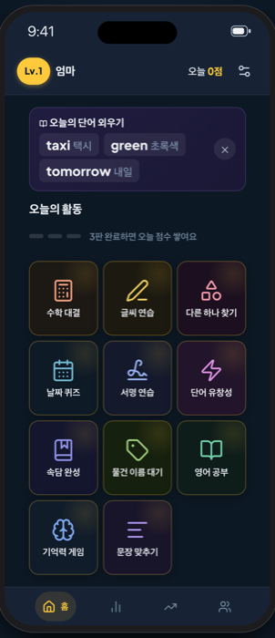
The cover story
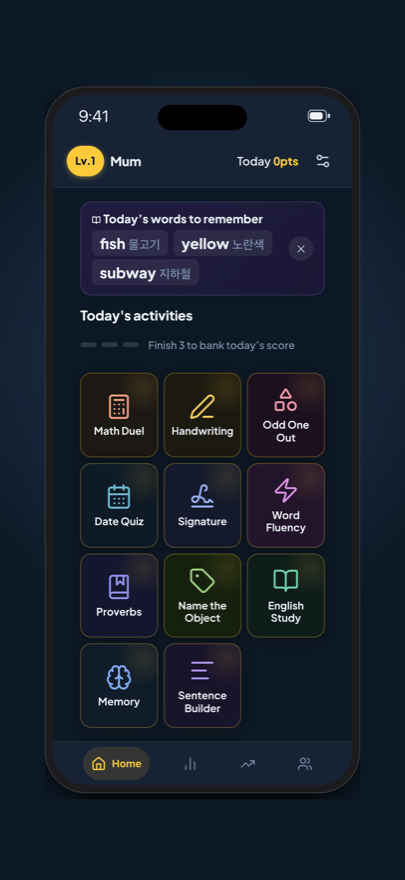
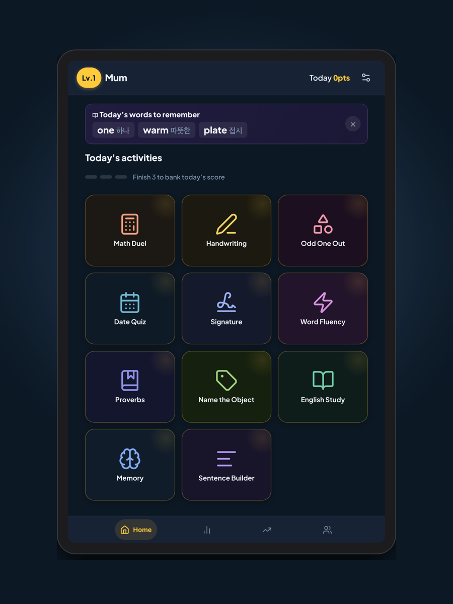
Eleven game tiles. The clinical layer is invisible.
Today's points
Points place the family along a shared trail over a rolling week.
Bottom nav
Four tabs in thumb reach. The family earned a tab of its own.
The cover story
Eleven game tiles. The clinical layer is invisible.
Today's points
Points place the family along a shared trail over a rolling week.
Bottom nav
Four tabs in thumb reach. The family earned a tab of its own.
The games
Each game maps to a K-MMSE domain, and the English had to be convincing
The hardest tradeoff: to keep the cover believable, some games lean more toward vocabulary drill than I wanted. They served the story more than the cognitive goals. A language toggle let Dad play harder Korean activities instead, and the app stayed clinically complete. Later, making every activity bilingual made the toggle unnecessary.
Toggle in Settings
Seven games, split by language
- 4 always on: 수학 대결, 날짜 퀴즈, 글씨 연습, 다른 하나 찾기
- English mode: 3 vocabulary games
- Korean mode: 단어 유창성, 속담 완성, 물건 이름 대기
1.1
Eleven, all bilingual
- 서명 연습 became the eleventh
- Toggle removed
- App follows the device language
1.2.1
Brain Check + Language Practice
- Scored check, three games a day
- Vocab Quiz and Sentence Builder move to unscored practice
- Delayed word recall and Word Meanings join the check
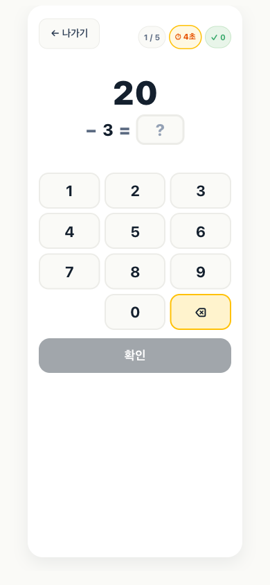
K-MMSE calculation task
Serial 7s and 3s, each answer held in mind while computing the next.
Cover story
Framed as a math duel against the family.
Timer pressure
Tighter limits at higher levels stress sustained attention.
K-MMSE calculation task
Serial 7s and 3s, each answer held in mind while computing the next.
Cover story
Framed as a math duel against the family.
Timer pressure
Tighter limits at higher levels stress sustained attention.
The original seven
Seven at first, eleven by 1.1
The Korean side added 단어 유창성 (word fluency by category), 속담 완성 (proverb completion) and 물건 이름 대기 (object naming from description). 서명 연습 (signature practice) became the eleventh: the same signature written over and over, kept and dated, so change in the hand is visible. For how they split in 1.2.1, see Brain Check.
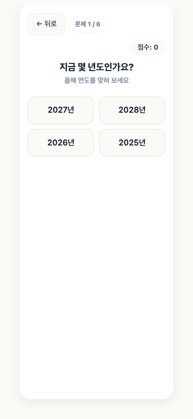
날짜 퀴즈
Date Quiz
Year, month, date, day of week, season, time of day: six of the ten K-MMSE orientation items. Now weekly, since the same questions every day stop meaning much.
수학 대결
Serial Subtraction
Serial 7s and 3s, the calculation task from the K-MMSE. Each answer is held in mind while computing the next.
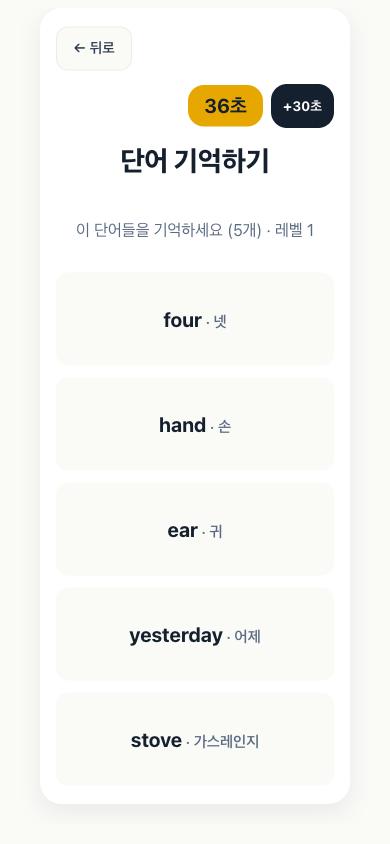
기억력 게임
Memory Game
Five words, tested after two other activities create interference. Distractors come from the same theme, which makes recall harder.
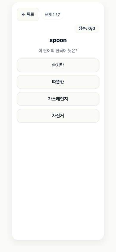
영어 공부
Vocab Quiz
Word-object association across 14 weekly themes. The core of the cover story. Now unscored practice.
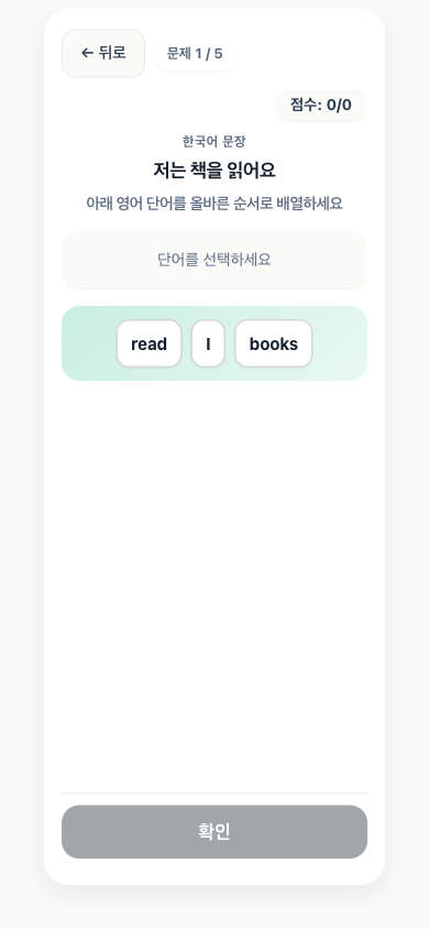
문장 맞추기
Sentence Builder
Arrange words into a correct sentence. Built in the learning language, so now unscored practice.
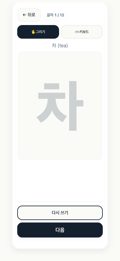
글씨 연습
Letter Tracing
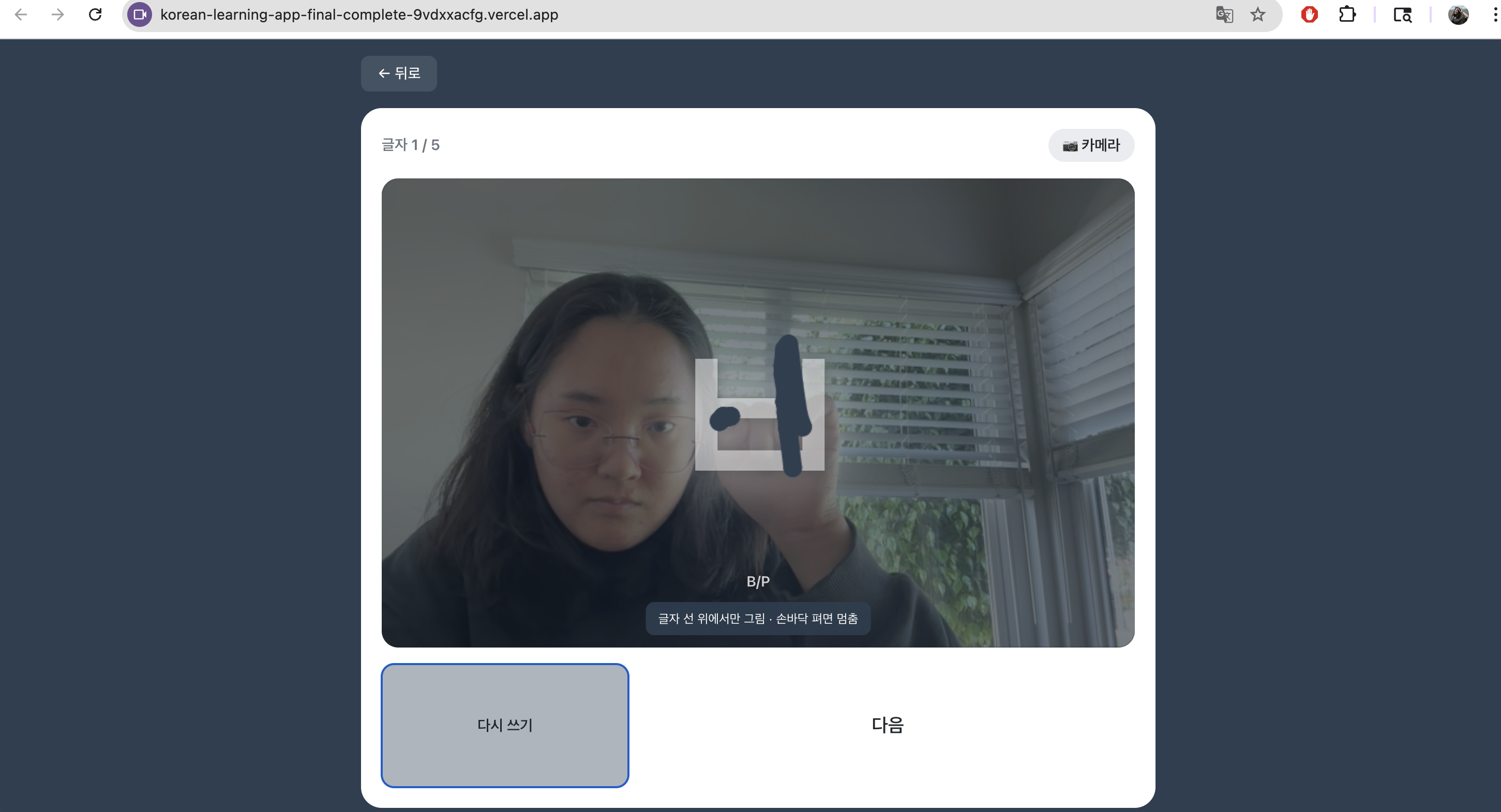
Trace Korean and English characters. Maps to the K-MMSE visuospatial task and exercises fine motor coordination.
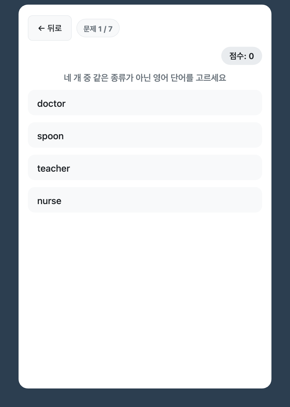
다른 하나 찾기
Odd One Out
Four words, one from a different category. Tests abstract reasoning and semantic memory.
Scoring
Two number systems with different jobs
Points drive the competition. XP drives difficulty. Before 1.2 the trail reset at midnight, so mid-afternoon it could show one person and an “invite your family” prompt to someone whose family was one tab away. Now it counts seven rolling days, so it is never empty.
Points
Where you are on the family trail
- Earned by finishing three games in a day (two might be a warmup)
- Counted over seven rolling days since 1.2, not reset at midnight
- A missed day costs ground. It does not wipe the trail
- Shared with the family
XP
How hard the games get
- Cumulative. Never resets
- 14 to 71 XP per activity on a quadratic curve. A score of zero still earns 14
- XP sets level, level sets difficulty
- Difficulty is never shown as a setting
What a higher level changes, without saying so
Measuring
One instrument was doing two jobs with opposite needs
I simulated the update rule and counted the item banks. At one session a day the fixed banks cycled in 2 to 9 days, and faster as players improved: the top band asked Odd One Out for 22 questions from a bank of 20.
The ability score, an item-response estimate (θ), had a bigger problem. It was clamped, so a fall from 95% to 75% accuracy didn't move it at all.
Training and measurement were sharing one instrument, so I split them.
| Training wants | Measurement wants | |
|---|---|---|
| Repetition | Items the player has never seen | |
| Difficulty that follows the player | Fixed difficulty | |
| Content that never runs out | Accuracy left free to move | |
| Now | Keeps its adaptive difficulty | A probe every 30 days, from reserved items training never shows. Plain accuracy, with its date and denominator. |
A fall from 0.95 to 0.85 now comes back as −0.10. The cost is resolution: one probe can't separate a real change from a bad day. Until the second probe, the trend arrows are hidden instead of showing a number that stopped moving.
Whose Record
The disguise stops at the data
Points, streaks and who played today are shared inside a family automatically. Cognitive results are not. Nobody sees them until the owner grants one named person access, and that access can be taken back. The measurement data stays on the device.
I also built a one-page record for a doctor, exportable only for your own data. It is switched off until a lawyer has read it, because a page that shows a doctor cognitive results is where a game starts to look like a medical device. For now, results show only to their owner, as dated numbers with no interpretation.
Brain Check
The data said nobody was playing enough to measure, so the disguise came off
On 25 September I counted. In the previous 30 days the most play days anyone had logged was 4, and that was me. Most profiles had 1 or 2. A trend needs at least 6 days in 30, so no one's record could support one. And a free choice of any 3 of 11 games let someone skip the one getting hard, which is the one a measurement most needs.
So in 1.2.1 the app opens on a Brain Check, and Language Practice stays locked until it's done.
1 · Brain Check, scored
Three games, picked by a fixed rotation
- Same set on the phone and the iPad
- Every domain comes round within two or three days. Date quiz weekly
- Native language, or no language at all
- The only thing that counts toward the streak
2 · Language Practice, unscored
Vocabulary and sentence games
A language you are learning keeps improving, so a score on it could rise while memory slips.
Guards on a required check
Crash or denied mic
One skip a day. It records a gap and a reason, never a zero.
Rushing to reach practice
Every game records how long it took.
Reminders
Only on days the check is not done.
Came to learn a language
The lock is a per-person setting.
Dropping the disguise also fixed an ethical problem. “He thinks he is practising English” describes measuring someone's cognition without telling them. The game stays warm, and the check is named.
Ranking
The data could not draw a ranked list honestly
The scoreboard was a numbered list. But the backend knows far less about other people than about you: circle_scores returns a bare completed boolean for everyone else, and the 0 / 3 count exists only for whoever holds the iPad. Points are the only thing it can say about all of us, so position had to be points.
So everyone goes on one trail, placed by score. Players on nil points wait together at the start line. I tried twice to nudge tied pins apart, and both times the labels collided.
I also cut the activity-progress component and five taunt strings that needled you for falling behind.

One shared trail
Placed by score, read as distance travelled.
Nobody is last
Players on nil points wait together at the start line.
Close scores cluster
Adjacent players merge into one band with a range.
One shared trail
Placed by score, read as distance travelled.
Nobody is last
Players on nil points wait together at the start line.
Close scores cluster
Adjacent players merge into one band with a range.
Offline
A slow connection can't break the streak
Miss a day and the streak resets. If it reset because Supabase was slow over home wifi, Dad would stop trusting it. So every streak update and session save goes to localStorage first.
Game finished
Streak update or session save
localStorage
Written first. If the network fails, this copy is the truth.
Supabase
Syncs when the connection returns. The higher streak wins.
Design Iterations
The version that shipped wasn't the first idea
Desktop first, camera-assisted
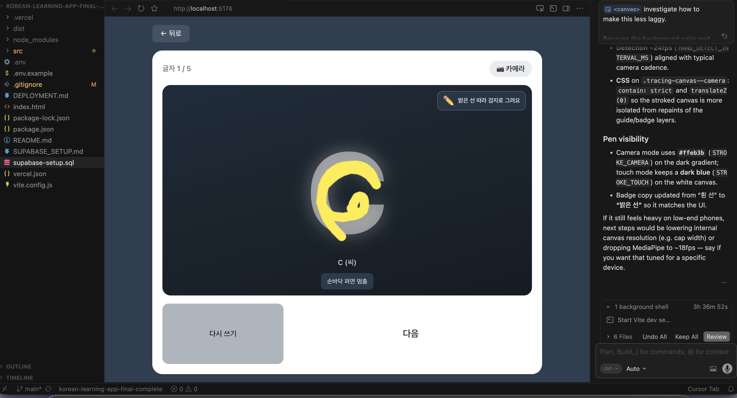
Desktop and iPad first, so 글씨 연습 had room, with MediaPipe hand tracking for tracing letters in mid-air. It lasted 15 minutes. Tracking ran at ~12fps and was tiring, and my dad doesn't open his laptop or iPad every day.
Cream and pastels
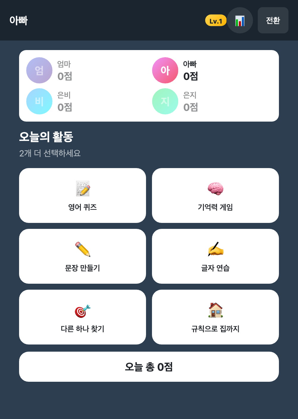
On mobile, the first look was dark navy with plain white tiles and emoji. It looked like a productivity tool. My argument was that dark reads as a tool and pastels read as a game, so I rebuilt it in warm off-white with seven pastel gradients and Lucide icons.
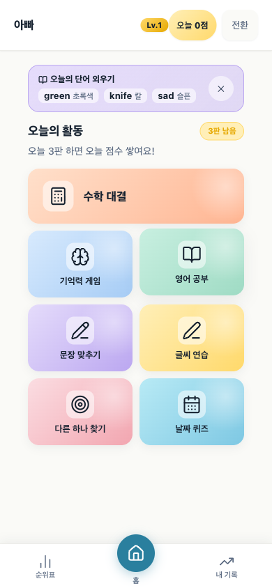
The two users overruled me
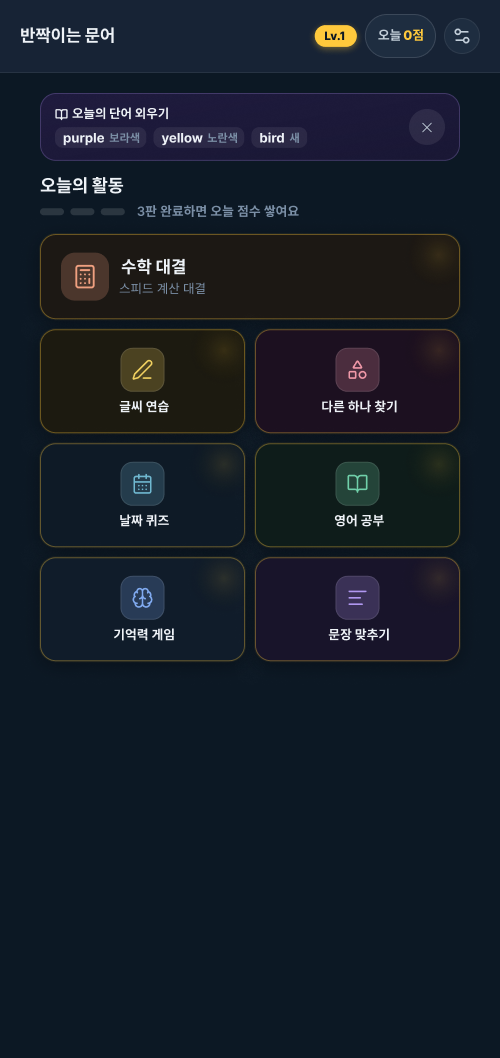
The cream build shipped on 2 May and was gone on 20 May. Mom and Dad both preferred the dark version and found it easier to read, and their preference outranks my argument. The page went back to deep navy with gold. Each activity kept its own colour as a lit icon and a gradient on its own dark card, so the grid still reads as a set of games.
Light mode stayed as an option. In submission week I found it never overrode an accent, so gold text sat at 1.4:1 against white, where the floor is 4.5:1. After four text-only tokens and 59 repointed rules, the tightest pair in either theme measures 4.82:1. The app now opens dark.
Design Decisions
Five smaller choices
Mobile-first
It gets used on a phone, probably one-handed, at a kitchen table. Every target is at least 44×44px, primary actions sit in a bottom nav within thumb reach, and safe-area insets handle notched phones.
Icons, not emoji
The first version used emoji. They render differently across OS versions and can't be styled, so I replaced every one with Lucide SVG icons, which keep one stroke weight and take a theme.
No tutorial
If a 65-year-old needs a tutorial to start a game, the design failed. Each intro screen shows what the game is and a large start button. The first two questions teach the rules.
Accessibility as display preference
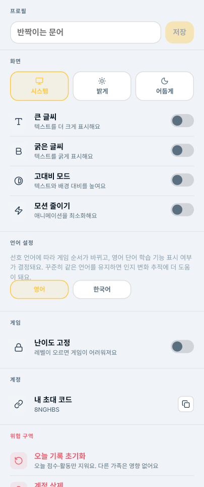
Four switches in Settings: bigger text, bolder text, high contrast, reduced motion. None is labelled "accessibility" or "for older users". If the label implies a need, people won't turn it on.
Level lock
Difficulty rises with XP until a game can feel too hard. One toggle, 난이도 고정, freezes it. Dad doesn't have to explain or admit anything, and the habit stays intact.
Settings and dark mode, cream build (May 2026)
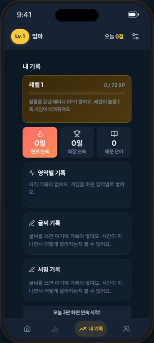
XP never resets
Cumulative XP sets level and difficulty. A zero still earns 14.
Streak counter
Saved locally before Supabase, so a bad connection can't break it.
Private by default
Nobody sees these until the owner grants one named person access.
XP never resets
Cumulative XP sets level and difficulty. A zero still earns 14.
Streak counter
Saved locally before Supabase, so a bad connection can't break it.
Private by default
Nobody sees these until the owner grants one named person access.
Localization
Two correct words, and the one I preferred lost
The home-screen label is the only text my primary users read before opening the app, and a localized CFBundleDisplayName costs one strings file. My first pick for Korean was 머리 over 두뇌. Both are correct, but 두뇌 as branding carries a 1990s educational-marketing register (두뇌 개발, 영재 두뇌) and makes a game sound like screening.
I reverted it the same day. 두뇌게임 and 두뇌훈련 are what the category is called in Korean and carry the search volume. 머리운동 does not, and an app nobody finds can't reassure anybody.
The revert missed one file. ko.lproj/InfoPlist.strings was written during the experiment, so through 1.1 a Korean device said 두뇌 시간이에요 in the daily notification and 머리 시간 under the icon. I shipped 1.1 anyway: an icon label isn't indexed, and a review cycle cost more than the inconsistency. 1.2 put 두뇌 시간 under the icon. What I took from it: a revert that touches several files leaves no record of the ones it missed.
How it shippedBackend, packaging, and App ReviewOffline-first writes, the iOS wrapper, and what it took to get through review.
How the Backend Works
localStorage-first writes, optimistic locks on XP
Two Supabase tables: daily_sessions (one row per user per day: scores, completed activities, daily points) and user_progress (cumulative XP, level, streak). The trail polls daily_sessions every 10 seconds, so when Mom finishes a game, Dad sees it within seconds. XP uses an optimistic lock so a network retry can never award the same points twice.
export const updateStreak = async (userId) => {
  const today = getTodayDate();

  // Step 1: read best available prior state
  const local = readLocalStreak(userId);
  let curStreak  = local?.currentStreak    ?? 0;
  let longStreak = local?.longestStreak    ?? 0;

  // Step 2: compute new streak
  const { currentStreak, longestStreak } =
    computeStreak(local?.lastActivityDate,
                  curStreak, longStreak, today);

  // Step 3: always write locally, works offline
  writeLocalStreak(userId, {
    currentStreak, longestStreak,
    lastActivityDate: today,
  });

  // Step 4: best-effort Supabase sync
  if (!isSupabaseConfigured()) return;
  try {
    await updateUserProgress(userId, {
      current_streak: currentStreak,
      longest_streak: longestStreak,
      last_activity_date: today,
    });
  } catch (err) {
    // local state preserved, will sync next session
    console.warn('Supabase sync failed', err.message);
  }
};export const recordActivityXp = async (
userId, activityPoints
) => {
const gain = computeXpGain(activityPoints);
const prog = await ensureUserProgressRow(userId);
const curXp = prog.xp ?? 0;
const newXp = curXp + gain;
const newLevel = xpToLevel(newXp);
// Optimistic lock: only succeeds if XP unchanged.
// If a retry already ran, 0 rows match → no double-count.
const { data } = await supabase
.from('user_progress')
.update({ xp: newXp, level: newLevel })
.eq('user_id', userId)
.eq('xp', curXp) // ← the lock
.select('xp, level')
.maybeSingle();
if (data) return { gain, xp: data.xp, level: data.level };
// 0 rows matched: XP already updated. Re-read, award 0.
const { data: latest } = await supabase
.from('user_progress')
.select('xp, level')
.eq('user_id', userId)
.single();
return { gain: 0, xp: latest.xp, level: latest.level };
};Packaging
What putting it on a phone actually asked for
I wrapped the existing web build in Capacitor instead of rewriting it, so every game and CSS file stayed as it was. The tradeoff: a WKWebView instead of a native framework, with Guideline 4.2 (minimum functionality) as the known risk.
Invitations arrive by KakaoTalk, which opens links in its own web view. Universal Links are least reliable there and Apple's Smart App Banner doesn't render at all, so the browser landing page may be the main path and has to be designed as one.
A full-screen game hides the dashboard header, so the top of the game becomes the top of the screen. Every other rule took its safe-area inset, but nobody owned that edge, and the back button sat under the Dynamic Island.
The privacy questionnaire found something worse. Both policy pages said the app doesn't touch the microphone, but the word fluency game has used Apple's speech recognizer since the day it was built. The policy denied it. It is now bilingual with the Korean governing, names Apple as an overseas transfer recipient as PIPA requires, and declining the permission leaves the activity playable by typing.
The build that shipped
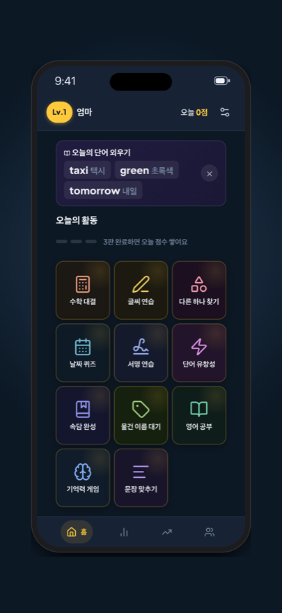
The same eleven activities, in whichever language the phone is already in
App Store screenshots from the real build: the same four screens on an English device and a Korean one. Only the chrome changes. Handwriting still traces Hangul, because the characters are the material being studied.
English device
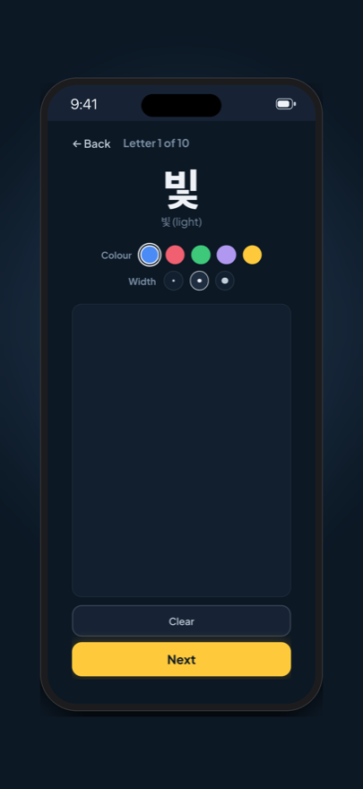
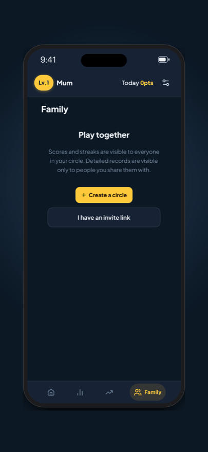
한국어 device
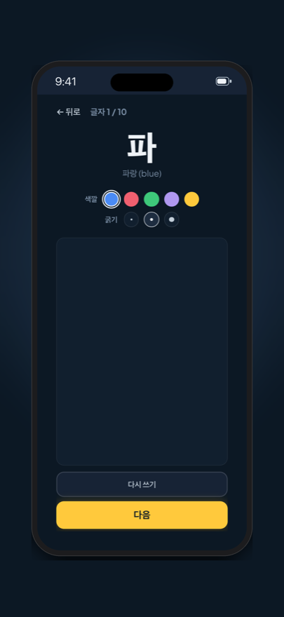
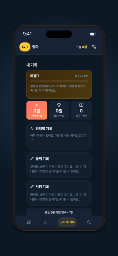
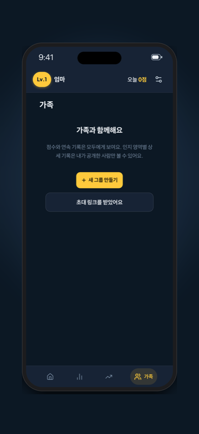
Submitted
What went into App Review
The first submission was approved and released the next day, with 1.1 two days after that. 1.2 is live now. 1.2.1, which carries the Brain Check, went into review on 30 September as build 33.
A reviewer works alone, on one device, with no second account, and three true things about this app look broken from there: there is no sign-in, the family invite is a single-use link with nobody to send it to, and some content stays Korean on purpose. The review notes cover each one.
The last blocker: App Store Connect wanted a demo username and password because “Sign-in required” was ticked on an app with no sign-in. Unticking it was the fix.
Version
1.0 (3)
Submitted
16 Sep 2026
Released
17 Sep 2026
Localized
English · 한국어
The week before that
ARCHIVE SUCCEEDED, signed for the wrong destination
TestFlight was empty, months after I believed builds were going up. Archiving locally showed why: xcodebuild printed ARCHIVE SUCCEEDED while signing with an Apple Development certificate and a provisioning profile that names specific devices, which the store refuses.
Only the exported .ipa showed Apple Distribution, get-task-allow off and no device list, so that is the file to inspect. Build 2 went up that way and was replaced anyway, because it predated the in-app privacy link and the dark default.
Outcome
Did he play today? Measured this time
I set one metric from the start: did he play today? For months I answered it from what I believed, which was yes. When I read it out of the database, it was mostly no.
| 17 | 18 | 19 | 20 | 21 | 22 | 23 | 24 | 25 | 26 | 27 | 28 | 29 | 30 | |
|---|---|---|---|---|---|---|---|---|---|---|---|---|---|---|
| Dad | ||||||||||||||
| Me | ||||||||||||||
| Stranger A | ||||||||||||||
| Stranger B |
Dad played on 2 of the first 14 days on the App Store. In April, before accounts existed, it was 3 of 23. My parents like the app. Liking it and opening it every morning turned out to be different things.
The most regular player is a stranger who joined on 26 September, set up a two-person family, and has finished about ten activities a day since. One person is not a finding, but it is the first sign the app holds someone with no reason to be polite to me.
1.2.1 went into review on 30 September. The test is whether Dad's row fills in over October. I'll know from the data, not from asking.
Limits and open questions
What this project cannot claim yet
One family and two strangers. That is enough to find out a design is wrong, and too little to say one works.
Nothing is validated. The probes have never been compared with a clinician giving the real K-MMSE, so a fall in probe accuracy is a reason to ask.
Practising the test can change the test. Several games use actual K-MMSE tasks, like serial subtraction and date orientation. Daily practice could raise a score at a real screening and hide the decline it exists to catch. Moving the date quiz to weekly reduces this but doesn't solve it.
What I'd study next: how often someone has to play before a home measure means anything, whether timing alone can tell a rushed session from real decline, and whether an openly named brain check keeps older adults playing as well as a disguised one.
with love, THE favorite daughter